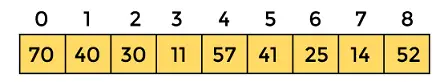
Python의 그래프 플로팅 | 세트 1
이 시리즈에서는 가장 널리 사용되는 그래프 작성 및 데이터 시각화 라이브러리인 Matplotlib을 사용하여 Python으로 그래프 작성하는 방법을 소개합니다. 파이썬 .
설치
matplotlib를 설치하는 가장 쉬운 방법은 pip를 사용하는 것입니다. 터미널에 다음 명령을 입력합니다.
pip install matplotlib
또는 다음에서 다운로드할 수 있습니다. 여기 수동으로 설치하십시오.
Python에서는 이를 수행하는 다양한 방법이 있습니다. 여기에서는 플로팅에 일반적으로 사용되는 몇 가지 방법에 대해 논의하고 있습니다. matplotlib 파이썬에서. 그것들은 다음과 같습니다.
- 선 그리기
- 동일한 도표에 두 개 이상의 선 그리기
- 플롯의 사용자 정의
- Matplotlib 막대 차트 그리기
- Matplotlib 히스토그램 그리기
- Matplotlib 플로팅 산포도
- Matplotlib 원형 차트 그리기
- 주어진 방정식의 곡선 그리기
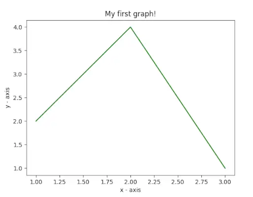
선 그리기
이 예에서 코드는 Matplotlib를 사용하여 간단한 선 플롯을 생성합니다. 데이터 포인트의 x 및 y 값을 정의하고 `를 사용하여 플롯합니다. plt.플롯() `, `plt.xlabel()` 및 `plt.ylabel()`을 사용하여 x 및 y 축에 레이블을 지정합니다. 줄거리 제목은 My first graph! `plt.title()`을 사용합니다. 마지막으로 ` plt.show() ` 함수는 지정된 데이터, 축 레이블 및 제목을 포함하는 그래프를 표시하는 데 사용됩니다.
파이썬
# importing the required module> import> matplotlib.pyplot as plt> # x axis values> x> => [> 1> ,> 2> ,> 3> ]> # corresponding y axis values> y> => [> 2> ,> 4> ,> 1> ]> # plotting the points> plt.plot(x, y)> # naming the x axis> plt.xlabel(> 'x - axis'> )> # naming the y axis> plt.ylabel(> 'y - axis'> )> # giving a title to my graph> plt.title(> 'My first graph!'> )> # function to show the plot> plt.show()> |
산출:

동일한 플롯에 두 개 이상의 선 플로팅
이 예제 코드에서는 Matplotlib를 사용하여 두 개의 선이 있는 그래프를 만듭니다. 각 라인에 대해 두 세트의 x 및 y 값을 정의하고 `plt.plot()`을 사용하여 플롯합니다. 줄은 'label' 매개변수를 사용하여 줄 1과 줄 2로 표시됩니다. 축에는 `plt.xlabel()` 및 `plt.ylabel()` 레이블이 지정되고 그래프 제목은 Two line on the same graph! `plt.title()`을 사용합니다. 범례는 `를 사용하여 표시됩니다. plt.전설() `, `plt.show()` 함수는 선과 레이블을 모두 사용하여 그래프를 시각화하는 데 사용됩니다.
파이썬
import> matplotlib.pyplot as plt> # line 1 points> x1> => [> 1> ,> 2> ,> 3> ]> y1> => [> 2> ,> 4> ,> 1> ]> # plotting the line 1 points> plt.plot(x1, y1, label> => 'line 1'> )> # line 2 points> x2> => [> 1> ,> 2> ,> 3> ]> y2> => [> 4> ,> 1> ,> 3> ]> # plotting the line 2 points> plt.plot(x2, y2, label> => 'line 2'> )> # naming the x axis> plt.xlabel(> 'x - axis'> )> # naming the y axis> plt.ylabel(> 'y - axis'> )> # giving a title to my graph> plt.title(> 'Two lines on same graph!'> )> # show a legend on the plot> plt.legend()> # function to show the plot> plt.show()> |
산출:

플롯의 사용자 정의
이 예제 코드에서는 Matplotlib를 사용하여 맞춤형 선 플롯을 생성합니다. 이는 x 및 y 값을 정의하며 플롯 스타일은 녹색 점선, 각 점에 대한 파란색 원형 마커 및 12의 마커 크기로 지정됩니다. y축 제한은 1과 8로 설정되고 x축은 `plt.ylim()` 및 `plt.xlim()`을 사용하여 제한을 1과 8로 설정합니다. 축에는 'plt.xlabel()' 및 'plt.ylabel()'이라는 레이블이 지정되고 그래프 제목은 Some 멋진 사용자 정의! `plt.title()`을 사용합니다.
파이썬
import> matplotlib.pyplot as plt> # x axis values> x> => [> 1> ,> 2> ,> 3> ,> 4> ,> 5> ,> 6> ]> # corresponding y axis values> y> => [> 2> ,> 4> ,> 1> ,> 5> ,> 2> ,> 6> ]> # plotting the points> plt.plot(x, y, color> => 'green'> , linestyle> => 'dashed'> , linewidth> => 3> ,> > marker> => 'o'> , markerfacecolor> => 'blue'> , markersize> => 12> )> # setting x and y axis range> plt.ylim(> 1> ,> 8> )> plt.xlim(> 1> ,> 8> )> # naming the x axis> plt.xlabel(> 'x - axis'> )> # naming the y axis> plt.ylabel(> 'y - axis'> )> # giving a title to my graph> plt.title(> 'Some cool customizations!'> )> # function to show the plot> plt.show()> |
산출:

Matplotlib 플로팅 막대 차트 사용
이 예제 코드에서는 Matplotlib를 사용하여 막대 차트를 만듭니다. 이는 x 좌표(`left`), 막대의 높이(`height`) 및 막대의 레이블(`tick_label`)을 정의합니다. 그런 다음 'plt.bar()' 함수를 사용하여 막대 너비, 색상, 레이블과 같은 지정된 매개변수를 사용하여 막대 차트를 그립니다. 축에는 `plt.xlabel()` 및 `plt.ylabel()` 레이블이 지정되고 차트 제목은 My bar Chart!입니다. `plt.title()`을 사용합니다.
파이썬
import> matplotlib.pyplot as plt> # x-coordinates of left sides of bars> left> => [> 1> ,> 2> ,> 3> ,> 4> ,> 5> ]> # heights of bars> height> => [> 10> ,> 24> ,> 36> ,> 40> ,> 5> ]> # labels for bars> tick_label> => [> 'one'> ,> 'two'> ,> 'three'> ,> 'four'> ,> 'five'> ]> # plotting a bar chart> plt.bar(left, height, tick_label> => tick_label,> > width> => 0.8> , color> => [> 'red'> ,> 'green'> ])> # naming the x-axis> plt.xlabel(> 'x - axis'> )> # naming the y-axis> plt.ylabel(> 'y - axis'> )> # plot title> plt.title(> 'My bar chart!'> )> # function to show the plot> plt.show()> |
출력 :

Matplotlib 플로팅 히스토그램 사용
이 예제 코드에서는 Matplotlib를 사용하여 히스토그램을 생성합니다. 이는 연령 빈도 목록을 정의합니다( ages> ), 값 범위를 0에서 100까지 설정하고 Bin 수를 10으로 지정합니다. plt.hist()> 그런 다음 함수를 사용하여 색상, 히스토그램 유형 및 막대 너비를 포함하여 제공된 데이터 및 서식을 사용하여 히스토그램을 플롯합니다. 축에는 다음과 같은 라벨이 붙어 있습니다. plt.xlabel()> 그리고 plt.ylabel()> , 차트 제목은 다음을 사용한 내 히스토그램입니다. plt.title()> .
파이썬
import> matplotlib.pyplot as plt> # frequencies> ages> => [> 2> ,> 5> ,> 70> ,> 40> ,> 30> ,> 45> ,> 50> ,> 45> ,> 43> ,> 40> ,> 44> ,> > 60> ,> 7> ,> 13> ,> 57> ,> 18> ,> 90> ,> 77> ,> 32> ,> 21> ,> 20> ,> 40> ]> # setting the ranges and no. of intervals> range> => (> 0> ,> 100> )> bins> => 10> # plotting a histogram> plt.hist(ages, bins,> range> , color> => 'green'> ,> > histtype> => 'bar'> , rwidth> => 0.8> )> # x-axis label> plt.xlabel(> 'age'> )> # frequency label> plt.ylabel(> 'No. of people'> )> # plot title> plt.title(> 'My histogram'> )> # function to show the plot> plt.show()> |
산출:

Matplotlib 플로팅 산점도 사용
이 예제 코드에서는 Matplotlib를 사용하여 산점도를 생성합니다. x 및 y 값을 정의하고 크기 30의 녹색 별표(`*`)가 있는 분산점으로 플롯합니다. 축에는 `plt.xlabel()` 및 `plt.ylabel()` 레이블이 지정되고 플롯 제목이 지정됩니다. 내 산점도! `plt.title()`을 사용합니다. 범례는 `plt.legend()`를 사용하여 별표 레이블로 표시되고, 결과 산점도는 `plt.show()`를 사용하여 표시됩니다.
파이썬
import> matplotlib.pyplot as plt> # x-axis values> x> => [> 1> ,> 2> ,> 3> ,> 4> ,> 5> ,> 6> ,> 7> ,> 8> ,> 9> ,> 10> ]> # y-axis values> y> => [> 2> ,> 4> ,> 5> ,> 7> ,> 6> ,> 8> ,> 9> ,> 11> ,> 12> ,> 12> ]> # plotting points as a scatter plot> plt.scatter(x, y, label> => 'stars'> , color> => 'green'> ,> > marker> => '*'> , s> => 30> )> # x-axis label> plt.xlabel(> 'x - axis'> )> # frequency label> plt.ylabel(> 'y - axis'> )> # plot title> plt.title(> 'My scatter plot!'> )> # showing legend> plt.legend()> # function to show the plot> plt.show()> |
산출:

Matplotlib 플로팅 원형 차트 사용
이 예제 코드에서는 Matplotlib를 사용하여 원형 차트를 만듭니다. 다양한 활동(`활동`)에 대한 라벨, 각 라벨이 포함하는 부분(`슬라이스`), 각 라벨의 색상(`색상`)을 정의합니다. 그런 다음 'plt.pie()' 함수를 사용하여 시작 각도, 그림자, 특정 슬라이스에 대한 폭발, 반경 및 백분율 표시를 위한 autopct를 포함한 다양한 서식 옵션을 사용하여 원형 차트를 그립니다. 범례는 `plt.legend()`를 사용하여 추가되고, 결과 원형 차트는 `plt.show()`를 사용하여 표시됩니다.
파이썬
import> matplotlib.pyplot as plt> # defining labels> activities> => [> 'eat'> ,> 'sleep'> ,> 'work'> ,> 'play'> ]> # portion covered by each label> slices> => [> 3> ,> 7> ,> 8> ,> 6> ]> # color for each label> colors> => [> 'r'> ,> 'y'> ,> 'g'> ,> 'b'> ]> # plotting the pie chart> plt.pie(slices, labels> => activities, colors> => colors,> > startangle> => 90> , shadow> => True> , explode> => (> 0> ,> 0> ,> 0.1> ,> 0> ),> > radius> => 1.2> , autopct> => '%1.1f%%'> )> # plotting legend> plt.legend()> # showing the plot> plt.show()> |
위 프로그램의 출력은 다음과 같습니다.

주어진 방정식의 곡선 그리기
이 예제 코드에서는 Matplotlib 및 NumPy를 사용하여 사인파 플롯을 생성합니다. `np.arange()`를 사용하여 0에서 2π까지 0.1씩 x 좌표를 생성하고 `np.sin()`을 사용하여 각 x 값의 사인을 취하여 해당 y 좌표를 계산합니다. 그런 다음 'plt.plot()'을 사용하여 점을 플롯하면 사인파가 생성됩니다. 마지막으로 'plt.show()' 함수를 사용하여 사인파 플롯을 표시합니다.
파이썬
# importing the required modules> import> matplotlib.pyplot as plt> import> numpy as np> # setting the x - coordinates> x> => np.arange(> 0> ,> 2> *> (np.pi),> 0.1> )> # setting the corresponding y - coordinates> y> => np.sin(x)> # plotting the points> plt.plot(x, y)> # function to show the plot> plt.show()> |
산출:

그래서 이번 파트에서는 matplotlib에서 생성할 수 있는 다양한 유형의 플롯에 대해 논의했습니다. 다루지 않은 플롯이 더 있지만 여기서는 가장 중요한 플롯을 논의합니다.
- Python의 그래프 플로팅 | 세트 2
- Python의 그래프 플로팅 | 세트 3
techcodeview.com를 좋아하고 기여하고 싶다면 write.techcodeview.com를 사용하여 기사를 작성하거나 기사를 [email protected]로 메일로 보낼 수도 있습니다.
잘못된 내용을 발견했거나 위에서 논의한 주제에 대해 더 많은 정보를 공유하고 싶다면 의견을 작성해 주세요.