Matplotlib의 막대 그래프
막대 그래프 또는 막대 차트는 나타내는 값에 비례하는 길이와 높이를 갖는 직사각형 막대로 데이터 범주를 나타내는 그래프입니다. 막대 그래프는 가로 또는 세로로 표시할 수 있습니다. 막대 차트는 개별 범주 간의 비교를 설명합니다. 플롯의 축 중 하나는 비교되는 특정 범주를 나타내고, 다른 축은 해당 범주에 해당하는 측정값을 나타냅니다.
막대 그래프 만들기
그만큼 matplotlib Python의 API는 MATLAB 스타일 사용이나 객체 지향 API로 사용할 수 있는 bar() 함수를 제공합니다. 축과 함께 사용되는 bar() 함수의 구문은 다음과 같습니다.
plt.bar(x, height, width, bottom, align)
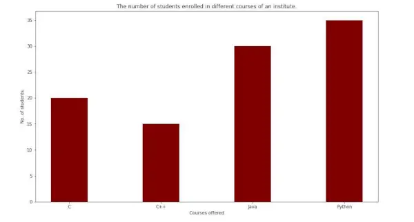
이 함수는 주어진 매개변수에 따라 직사각형으로 둘러싸인 막대 그래프를 생성합니다. 다음은 교육기관의 다양한 과정에 등록한 학생 수를 나타내는 막대 그래프의 간단한 예입니다.
파이썬3
import> numpy as np> import> matplotlib.pyplot as plt> > # creating the dataset> data> => {> 'C'> :> 20> ,> 'C++'> :> 15> ,> 'Java'> :> 30> ,> > 'Python'> :> 35> }> courses> => list> (data.keys())> values> => list> (data.values())> > fig> => plt.figure(figsize> => (> 10> ,> 5> ))> # creating the bar plot> plt.bar(courses, values, color> => 'maroon'> ,> > width> => 0.4> )> plt.xlabel(> 'Courses offered'> )> plt.ylabel(> 'No. of students enrolled'> )> plt.title(> 'Students enrolled in different courses'> )> plt.show()> |
산출-

여기서 plt.bar(courses, value, color='maroon')는 코스 열을 X축으로, 값을 Y축으로 사용하여 막대 차트를 그리도록 지정하는 데 사용됩니다. color 속성은 막대의 색상을 설정하는 데 사용됩니다(이 경우 적갈색).plt.xlabel(제공되는 강좌) 및 plt.ylabel(등록한 학생)은 해당 축에 레이블을 지정하는 데 사용됩니다.plt.title()은 다음과 같이 사용됩니다. graph.plt.show()의 제목을 만듭니다. 이전 명령을 사용하여 그래프를 출력으로 표시하는 데 사용됩니다.
막대 그래프 사용자 정의
파이썬3
import> pandas as pd> from> matplotlib> import> pyplot as plt> # Read CSV into pandas> data> => pd.read_csv(r> 'cars.csv'> )> data.head()> df> => pd.DataFrame(data)> name> => df[> 'car'> ].head(> 12> )> price> => df[> 'price'> ].head(> 12> )> # Figure Size> fig> => plt.figure(figsize> => (> 10> ,> 7> ))> # Horizontal Bar Plot> plt.bar(name[> 0> :> 10> ], price[> 0> :> 10> ])> # Show Plot> plt.show()> |
산출:

위의 막대 그래프를 보면 X축 눈금이 서로 겹쳐서 제대로 보이지 않는 것을 볼 수 있습니다. 따라서 X축 눈금을 회전시키면 명확하게 볼 수 있습니다. 이것이 바로 막대 그래프의 사용자 정의가 필요한 이유입니다.
파이썬3
import> pandas as pd> from> matplotlib> import> pyplot as plt> # Read CSV into pandas> data> => pd.read_csv(r> 'cars.csv'> )> data.head()> df> => pd.DataFrame(data)> name> => df[> 'car'> ].head(> 12> )> price> => df[> 'price'> ].head(> 12> )> # Figure Size> fig, ax> => plt.subplots(figsize> => (> 16> ,> 9> ))> # Horizontal Bar Plot> ax.barh(name, price)> # Remove axes splines> for> s> in> [> 'top'> ,> 'bottom'> ,> 'left'> ,> 'right'> ]:> > ax.spines[s].set_visible(> False> )> # Remove x, y Ticks> ax.xaxis.set_ticks_position(> 'none'> )> ax.yaxis.set_ticks_position(> 'none'> )> # Add padding between axes and labels> ax.xaxis.set_tick_params(pad> => 5> )> ax.yaxis.set_tick_params(pad> => 10> )> # Add x, y gridlines> ax.grid(b> => True> , color> => 'grey'> ,> > linestyle> => '-.'> , linewidth> => 0.5> ,> > alpha> => 0.2> )> # Show top values> ax.invert_yaxis()> # Add annotation to bars> for> i> in> ax.patches:> > plt.text(i.get_width()> +> 0.2> , i.get_y()> +> 0.5> ,> > str> (> round> ((i.get_width()),> 2> )),> > fontsize> => 10> , fontweight> => 'bold'> ,> > color> => 'grey'> )> # Add Plot Title> ax.set_title(> 'Sports car and their price in crore'> ,> > loc> => 'left'> , )> # Add Text watermark> fig.text(> 0.9> ,> 0.15> ,> 'Jeeteshgavande30'> , fontsize> => 12> ,> > color> => 'grey'> , ha> => 'right'> , va> => 'bottom'> ,> > alpha> => 0.7> )> # Show Plot> plt.show()> |
산출:

막대 그래프에 사용할 수 있는 사용자 정의가 더 많이 있습니다.
다중 막대 그래프
하나의 변수가 변경될 때 데이터 세트 간 비교를 수행할 때 다중 막대 그래프가 사용됩니다. 각 하위 그룹이 다른 하위 그룹 위에 하나씩 표시되는 누적 영역 막대형 차트로 쉽게 변환할 수 있습니다. 막대의 두께와 위치를 변경하여 플롯할 수 있습니다. 다음 막대 그래프는 엔지니어링 부문에 합격한 학생 수를 보여줍니다.
파이썬3
import> numpy as np> import> matplotlib.pyplot as plt> # set width of bar> barWidth> => 0.25> fig> => plt.subplots(figsize> => (> 12> ,> 8> ))> # set height of bar> IT> => [> 12> ,> 30> ,> 1> ,> 8> ,> 22> ]> ECE> => [> 28> ,> 6> ,> 16> ,> 5> ,> 10> ]> CSE> => [> 29> ,> 3> ,> 24> ,> 25> ,> 17> ]> # Set position of bar on X axis> br1> => np.arange(> len> (IT))> br2> => [x> +> barWidth> for> x> in> br1]> br3> => [x> +> barWidth> for> x> in> br2]> # Make the plot> plt.bar(br1, IT, color> => 'r'> , width> => barWidth,> > edgecolor> => 'grey'> , label> => 'IT'> )> plt.bar(br2, ECE, color> => 'g'> , width> => barWidth,> > edgecolor> => 'grey'> , label> => 'ECE'> )> plt.bar(br3, CSE, color> => 'b'> , width> => barWidth,> > edgecolor> => 'grey'> , label> => 'CSE'> )> # Adding Xticks> plt.xlabel(> 'Branch'> , fontweight> => 'bold'> , fontsize> => 15> )> plt.ylabel(> 'Students passed'> , fontweight> => 'bold'> , fontsize> => 15> )> plt.xticks([r> +> barWidth> for> r> in> range> (> len> (IT))],> > [> '2015'> ,> '2016'> ,> '2017'> ,> '2018'> ,> '2019'> ])> plt.legend()> plt.show()> |
산출:
누적 막대 그래프
누적 막대 그래프는 서로 겹쳐진 여러 그룹을 나타냅니다. 막대의 높이는 그룹 결과 조합의 결과 높이에 따라 달라집니다. 0에서 값으로 가는 대신 바닥에서 값으로 이동합니다. 다음 막대 그래프는 팀 내 남학생과 여학생의 기여도를 나타냅니다.
파이썬3
import> numpy as np> import> matplotlib.pyplot as plt> N> => 5> boys> => (> 20> ,> 35> ,> 30> ,> 35> ,> 27> )> girls> => (> 25> ,> 32> ,> 34> ,> 20> ,> 25> )> boyStd> => (> 2> ,> 3> ,> 4> ,> 1> ,> 2> )> girlStd> => (> 3> ,> 5> ,> 2> ,> 3> ,> 3> )> ind> => np.arange(N)> width> => 0.35> fig> => plt.subplots(figsize> => (> 10> ,> 7> ))> p1> => plt.bar(ind, boys, width, yerr> => boyStd)> p2> => plt.bar(ind, girls, width,> > bottom> => boys, yerr> => girlStd)> plt.ylabel(> 'Contribution'> )> plt.title(> 'Contribution by the teams'> )> plt.xticks(ind, (> 'T1'> ,> 'T2'> ,> 'T3'> ,> 'T4'> ,> 'T5'> ))> plt.yticks(np.arange(> 0> ,> 81> ,> 10> ))> plt.legend((p1[> 0> ], p2[> 0> ]), (> 'boys'> ,> 'girls'> ))> plt.show()> |
산출-