R 言語の散布図
散布図は、水平軸と垂直軸上の個々のデータを表す点のセットです。 2 つの変数の値が X 軸と Y 軸に沿ってプロットされたグラフでは、結果として得られる点のパターンによってそれらの間の相関関係が明らかになります。
R – 散布図
私たちは創造することができます ある の散布図 R プログラミング言語 を使用して プロット() 関数。
構文: プロット(x, y, メイン, xlab, ylab, xlim, ylim, 軸)
パラメーター:
x: このパラメータは水平座標を設定します。 y: このパラメータは垂直座標を設定します。 xlab: このパラメータは横軸のラベルです。 ylab: このパラメータは垂直軸のラベルです。 main: このパラメータ main はチャートのタイトルです。 xlim: このパラメータは、x の値をプロットするために使用されます。 ylim: このパラメータは、y の値をプロットするために使用されます。 axes: このパラメータは、プロット上に両方の軸を描画するかどうかを示します。
単純な散布図
散布図を作成するには:
- データセット mtcars を使用します。
- mtcars の列 wt と mpg を使用します。
例:
R
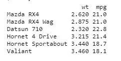
input <- mtcars[,> c> (> 'wt'> ,> 'mpg'> )]> print> (> head> (input))> |
出力:

散布図グラフの作成
R 散布図グラフを作成するには:
- グラフをプロットするために必要なパラメーターを使用しています。
- この「xlab」は X 軸を表し、「ylab」は Y 軸を表します。
例:
R
# Get the input values.> input <- mtcars[,> c> (> 'wt'> ,> 'mpg'> )]> # Plot the chart for cars with> # weight between 1.5 to 4 and> # mileage between 10 and 25.> plot> (x = input$wt, y = input$mpg,> > xlab => 'Weight'> ,> > ylab => 'Milage'> ,> > xlim => c> (1.5, 4),> > ylim => c> (10, 25),> > main => 'Weight vs Milage'> )> |
出力:
R 言語の散布図
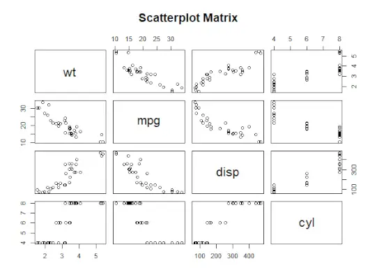
散布図行列
2 つ以上の変数があり、1 つの変数と他の変数を相関させたい場合は、R 散布図行列を使用します。
ペア() 関数は散布図の R 行列を作成するために使用されます。
構文: ペア(式、データ)
パラメーター:
式: このパラメータは、ペアで使用される一連の変数を表します。 data: このパラメータは、変数が取得されるデータセットを表します。
例:
R
# Plot the matrices between> # 4 variables giving 12 plots.> # One variable with 3 others> # and total 4 variables.> pairs> (~wt + mpg + disp + cyl, data = mtcars,> > main => 'Scatterplot Matrix'> )> |
出力:
R 言語の散布図
近似値を含む散布図
R 散布図を作成するには:
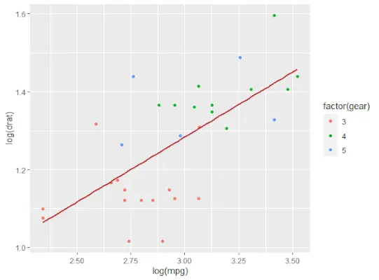
- 散布図を作成するための ggplot() および geom_point() 関数を提供する ggplot2 パッケージを使用しています。
- また、mtcars では列 wt と mpg を使用しています。
例:
R
# Loading ggplot2 package> library> (ggplot2)> > # Creating scatterplot with fitted values.> # An additional function stst_smooth> # is used for linear regression.> ggplot> (mtcars,> aes> (x => log> (mpg), y => log> (drat))) +> > geom_point> (> aes> (color => factor> (gear))) +> > stat_smooth> (method => 'lm'> ,> > col => '#C42126'> , se => FALSE> , size = 1> )> |
出力:
R 言語の散布図
動的な名前でタイトルを追加する
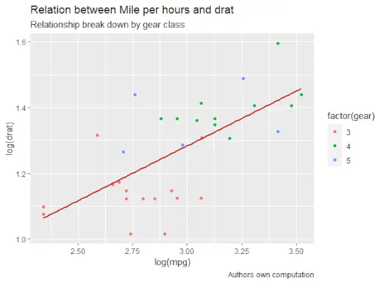
R 散布図を作成するには、サブタイトルを追加します。
- 追加関数を使用します。ggplot では、「aes」、「geom_point」を追加してデータセット mtcars を追加します。
- タイトル、キャプション、サブタイトルを使用します。
例:
R
# Loading ggplot2 package> library> (ggplot2)> > # Creating scatterplot with fitted values.> # An additional function stst_smooth> # is used for linear regression.> new_graph <-> ggplot> (mtcars,> aes> (x => log> (mpg),> > y => log> (drat))) +> > geom_point> (> aes> (color => factor> (gear))) +> > stat_smooth> (method => 'lm'> ,> > col => '#C42126'> ,> > se => FALSE> , size = 1)> # in above example lm is used for linear regression> # and se stands for standard error.> # Adding title with dynamic name> new_graph +> labs> (> > title => 'Relation between Mile per hours and drat'> ,> > subtitle => 'Relationship break down by gear class'> ,> > caption => 'Authors own computation'> )> |
出力:
R 言語の散布図
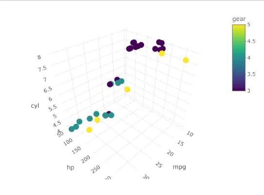
3D 散布図
ここでは R 散布図を使用して 3D 散布図を作成します。このパッケージは、scatterplot3d() メソッドを使用して R 散布図を 3D でプロットできます。
R
# 3D Scatterplot> library> (plotly)> attach> (mtcars)> plot_ly> (data=mtcars,x=~mpg,y=~hp,z=~cyl,color=~gear)> |
出力:
R 言語の散布図