Python でのグラフプロット |セット1
このシリーズでは、Matplotlib を使用した Python でのグラフ作成について紹介します。Matplotlib は、おそらく最も人気のあるグラフ作成およびデータ視覚化ライブラリです。 パイソン 。
インストール
matplotlib をインストールする最も簡単な方法は、pip を使用することです。ターミナルに次のコマンドを入力します。
pip install matplotlib
または、次からダウンロードできます。 ここ そして手動でインストールします。
Python でこれを行うにはさまざまな方法があります。ここでは、プロットに一般的に使用されるいくつかの方法について説明します。 マットプロットライブラリ Pythonで。それらは次のとおりです。
- 線を描く
- 同じプロット上に 2 つ以上の線をプロットする
- プロットのカスタマイズ
- Matplotlib 棒グラフのプロット
- Matplotlib ヒストグラムのプロット
- Matplotlib のプロット 散布図
- Matplotlib 円グラフのプロット
- 与えられた方程式の曲線をプロットする
線をプロットする
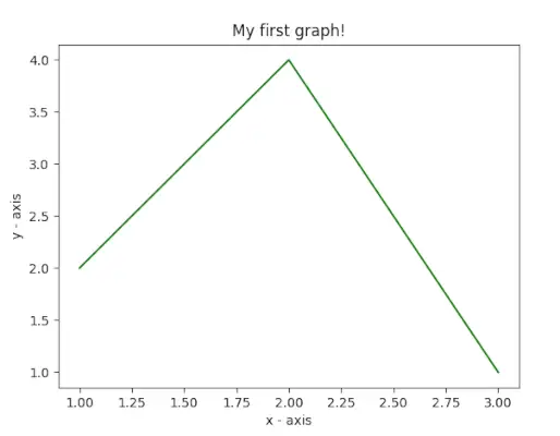
この例では、コードは Matplotlib を使用して単純な折れ線プロットを作成します。データ点の x 値と y 値を定義し、` を使用してプロットします。 plt.plot() ` そして、`plt.xlabel()` と `plt.ylabel()` で x 軸と y 軸にラベルを付けます。プロットのタイトルは「初めてのグラフ!」です。 `plt.title()` を使用します。最後に、` plt.show() ` 関数は、指定したデータ、軸ラベル、タイトルを含むグラフを表示するために使用されます。
パイソン
# importing the required module> import> matplotlib.pyplot as plt> # x axis values> x> => [> 1> ,> 2> ,> 3> ]> # corresponding y axis values> y> => [> 2> ,> 4> ,> 1> ]> # plotting the points> plt.plot(x, y)> # naming the x axis> plt.xlabel(> 'x - axis'> )> # naming the y axis> plt.ylabel(> 'y - axis'> )> # giving a title to my graph> plt.title(> 'My first graph!'> )> # function to show the plot> plt.show()> |
出力:

同じプロット上に 2 つ以上の線をプロットする
この例のコードでは、Matplotlib を使用して 2 つの折れ線を持つグラフを作成します。各行に 2 つの x 値と y 値のセットを定義し、それらを `plt.plot()` を使用してプロットします。これらの行には、「label」パラメータを使用して行 1 と行 2 としてラベルが付けられます。軸には `plt.xlabel()` と `plt.ylabel()` でラベルが付けられ、グラフには「同じグラフに 2 つの線!」というタイトルが付けられます。 `plt.title()` を使用します。凡例は ` を使用して表示されます plt.legend() `、`plt.show()` 関数を使用して、線とラベルの両方でグラフを視覚化します。
パイソン
import> matplotlib.pyplot as plt> # line 1 points> x1> => [> 1> ,> 2> ,> 3> ]> y1> => [> 2> ,> 4> ,> 1> ]> # plotting the line 1 points> plt.plot(x1, y1, label> => 'line 1'> )> # line 2 points> x2> => [> 1> ,> 2> ,> 3> ]> y2> => [> 4> ,> 1> ,> 3> ]> # plotting the line 2 points> plt.plot(x2, y2, label> => 'line 2'> )> # naming the x axis> plt.xlabel(> 'x - axis'> )> # naming the y axis> plt.ylabel(> 'y - axis'> )> # giving a title to my graph> plt.title(> 'Two lines on same graph!'> )> # show a legend on the plot> plt.legend()> # function to show the plot> plt.show()> |
出力:

プロットのカスタマイズ
この例のコードでは、Matplotlib を使用してカスタマイズされた折れ線プロットを作成します。 x 値と y 値を定義し、プロットは緑色の破線、各点の青色の円形マーカー、およびマーカー サイズ 12 でスタイル設定されます。y 軸の制限は 1 と 8 に設定され、x 軸は制限は `plt.ylim()` と `plt.xlim()` を使用して 1 と 8 に設定されます。軸には `plt.xlabel()` と `plt.ylabel()` のラベルが付けられ、グラフには「いくつかのクールなカスタマイズ!」というタイトルが付けられています。 `plt.title()` を使用します。
パイソン
import> matplotlib.pyplot as plt> # x axis values> x> => [> 1> ,> 2> ,> 3> ,> 4> ,> 5> ,> 6> ]> # corresponding y axis values> y> => [> 2> ,> 4> ,> 1> ,> 5> ,> 2> ,> 6> ]> # plotting the points> plt.plot(x, y, color> => 'green'> , linestyle> => 'dashed'> , linewidth> => 3> ,> > marker> => 'o'> , markerfacecolor> => 'blue'> , markersize> => 12> )> # setting x and y axis range> plt.ylim(> 1> ,> 8> )> plt.xlim(> 1> ,> 8> )> # naming the x axis> plt.xlabel(> 'x - axis'> )> # naming the y axis> plt.ylabel(> 'y - axis'> )> # giving a title to my graph> plt.title(> 'Some cool customizations!'> )> # function to show the plot> plt.show()> |
出力:

Matplotlib のプロット 棒グラフの使用
この例のコードでは、Matplotlib を使用して棒グラフを作成します。これは、x 座標 (`left`)、バーの高さ (`height`)、およびバーのラベル (`tick_label`) を定義します。次に、`plt.bar()` 関数を使用して、棒の幅、色、ラベルなどの指定されたパラメーターを使用して棒グラフをプロットします。軸は `plt.xlabel()` と `plt.ylabel()` でラベル付けされており、グラフのタイトルは My bar chart! です。 `plt.title()` を使用します。
パイソン
import> matplotlib.pyplot as plt> # x-coordinates of left sides of bars> left> => [> 1> ,> 2> ,> 3> ,> 4> ,> 5> ]> # heights of bars> height> => [> 10> ,> 24> ,> 36> ,> 40> ,> 5> ]> # labels for bars> tick_label> => [> 'one'> ,> 'two'> ,> 'three'> ,> 'four'> ,> 'five'> ]> # plotting a bar chart> plt.bar(left, height, tick_label> => tick_label,> > width> => 0.8> , color> => [> 'red'> ,> 'green'> ])> # naming the x-axis> plt.xlabel(> 'x - axis'> )> # naming the y-axis> plt.ylabel(> 'y - axis'> )> # plot title> plt.title(> 'My bar chart!'> )> # function to show the plot> plt.show()> |
出力:

Matplotlib のプロット ヒストグラムの使用
この例のコードでは、Matplotlib を使用してヒストグラムを作成します。年齢の頻度のリストを定義します ( ages> )、値の範囲を 0 ~ 100 に設定し、ビンの数を 10 に指定します。 plt.hist()> 次に、関数を使用して、色、ヒストグラム タイプ、バーの幅など、指定されたデータと書式設定を使用してヒストグラムをプロットします。軸には次のラベルが付いています plt.xlabel()> そして plt.ylabel()> 、グラフのタイトルは My histogram using plt.title()> 。
パイソン
import> matplotlib.pyplot as plt> # frequencies> ages> => [> 2> ,> 5> ,> 70> ,> 40> ,> 30> ,> 45> ,> 50> ,> 45> ,> 43> ,> 40> ,> 44> ,> > 60> ,> 7> ,> 13> ,> 57> ,> 18> ,> 90> ,> 77> ,> 32> ,> 21> ,> 20> ,> 40> ]> # setting the ranges and no. of intervals> range> => (> 0> ,> 100> )> bins> => 10> # plotting a histogram> plt.hist(ages, bins,> range> , color> => 'green'> ,> > histtype> => 'bar'> , rwidth> => 0.8> )> # x-axis label> plt.xlabel(> 'age'> )> # frequency label> plt.ylabel(> 'No. of people'> )> # plot title> plt.title(> 'My histogram'> )> # function to show the plot> plt.show()> |
出力:

Matplotlib のプロット 散布図の使用
この例のコードでは、Matplotlib を使用して散布図を作成します。 x 値と y 値を定義し、サイズ 30 の緑色のアスタリスク マーカー (`*`) が付いた散布点としてプロットします。軸には `plt.xlabel()` と `plt.ylabel()` のラベルが付けられ、プロットにはタイトルが付けられます。私の散布図! `plt.title()` を使用します。凡例は `plt.legend()` を使用してラベル star とともに表示され、結果の散布図は `plt.show()` を使用して表示されます。
パイソン
import> matplotlib.pyplot as plt> # x-axis values> x> => [> 1> ,> 2> ,> 3> ,> 4> ,> 5> ,> 6> ,> 7> ,> 8> ,> 9> ,> 10> ]> # y-axis values> y> => [> 2> ,> 4> ,> 5> ,> 7> ,> 6> ,> 8> ,> 9> ,> 11> ,> 12> ,> 12> ]> # plotting points as a scatter plot> plt.scatter(x, y, label> => 'stars'> , color> => 'green'> ,> > marker> => '*'> , s> => 30> )> # x-axis label> plt.xlabel(> 'x - axis'> )> # frequency label> plt.ylabel(> 'y - axis'> )> # plot title> plt.title(> 'My scatter plot!'> )> # showing legend> plt.legend()> # function to show the plot> plt.show()> |
出力:

Matplotlib のプロット 円グラフの使用
この例のコードでは、Matplotlib を使用して円グラフを作成します。さまざまなアクティビティのラベル (「アクティビティ」)、各ラベルでカバーされる部分 (「スライス」)、および各ラベルの色 (「カラー」) を定義します。次に、`plt.pie()` 関数を使用して、開始角度、影、特定のスライスの爆発、半径、パーセント表示の autopct などのさまざまな書式設定オプションを使用して円グラフをプロットします。凡例は `plt.legend()` で追加され、結果の円グラフは `plt.show()` を使用して表示されます。
パイソン
import> matplotlib.pyplot as plt> # defining labels> activities> => [> 'eat'> ,> 'sleep'> ,> 'work'> ,> 'play'> ]> # portion covered by each label> slices> => [> 3> ,> 7> ,> 8> ,> 6> ]> # color for each label> colors> => [> 'r'> ,> 'y'> ,> 'g'> ,> 'b'> ]> # plotting the pie chart> plt.pie(slices, labels> => activities, colors> => colors,> > startangle> => 90> , shadow> => True> , explode> => (> 0> ,> 0> ,> 0.1> ,> 0> ),> > radius> => 1.2> , autopct> => '%1.1f%%'> )> # plotting legend> plt.legend()> # showing the plot> plt.show()> |
上記のプログラムの出力は次のようになります。

与えられた方程式の曲線をプロットする
この例のコードでは、Matplotlib と NumPy を使用して正弦波プロットを作成します。 `np.arange()` を使用して 0 から 2π までの x 座標を 0.1 刻みで生成し、`np.sin()` を使用して各 x 値の正弦を取ることによって対応する y 座標を計算します。次に、「plt.plot()」を使用して点がプロットされ、正弦波が得られます。最後に、`plt.show()` 関数を使用して正弦波プロットを表示します。
パイソン
# importing the required modules> import> matplotlib.pyplot as plt> import> numpy as np> # setting the x - coordinates> x> => np.arange(> 0> ,> 2> *> (np.pi),> 0.1> )> # setting the corresponding y - coordinates> y> => np.sin(x)> # plotting the points> plt.plot(x, y)> # function to show the plot> plt.show()> |
出力:

したがって、このパートでは、matplotlib で作成できるさまざまなタイプのプロットについて説明しました。取り上げられていないプロットは他にもありますが、最も重要なプロットについてはここで説明します。
- Python でのグラフプロット |セット2
- Python でのグラフプロット |セット3
techcodeview.com が気に入って貢献したい場合は、write.techcodeview.com を使用して記事を書くか、記事を [email protected] にメールで送信することもできます。
間違っている点を見つけた場合、または上記のトピックについてさらに詳しい情報を共有したい場合は、コメントを書いてください。


![軍事力別世界最強国トップ10 [2023]](https://techcodeview.com/img/current-gk/40/top-10-most-powerful-country-world-military-strength.webp)