React のボタン
ボタンを使用すると、ユーザーは 1 回タップするだけでアクションを実行し、選択を行うことができます。
これら (ボタン) は、ユーザーが実行できるアクションを伝達します。これは、UI によって以下のような場所に配置されます。
- モーダルウィンドウ
- フォーム
- カード
- ツールバー
- 基本ボタン
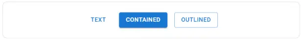
ボタンには 3 つのバリエーションがあります。 テキスト (デフォルト)、含まれる、 そして 概説した。

import * as React from 'react'; import Stack from '@mui/material/Stack'; import Button from '@mui/material/Button'; export default function BasicButtons() { return ( Text Contained Outlined ); } テキストボタン
テキスト ボタンは、カード ダイアログ内のアクションなど、あまり目立たないアクションに使用されます。カードでは、テキスト ボタンを使用すると、カードのコンテンツを強調し続けることができます。

import * as React from 'react'; import Button from '@mui/material/Button'; import Stack from '@mui/material/Stack'; export default function TextButtons() { return ( Primary Disabled Link ); } 含まれるボタン
含まれるボタンは高度に強調され、エレベーションとフィルの使用によって区別されます。これには、アプリで主に使用されるアクションが含まれています。

import * as React from 'react'; import Button from '@mui/material/Button'; import Stack from '@mui/material/Stack'; export default function ContainedButtons() { return ( Contained Disabled Link ); } Elevation プロパティを無効にすることで標高を削除できます。

import * as React from 'react'; import Button from '@mui/material/Button'; export default function DisableElevation() { return ( Disable elevation ); } アウトラインボタン
アウトラインのボタンは中程度の強調のボタンです。これらには必須のアクションが含まれていますが、アプリの主要なアクションは含まれていません。
アウトライン付きのボタンは、ボタンが含まれる下部の代替、またはテキスト ボタンのより強調された代替です。

import * as React from 'react'; import Button from '@mui/material/Button'; import Stack from '@mui/material/Stack'; export default function OutlinedButtons() { return ( Primary Disabled Link ); } クリックの処理
すべてのコンポーネントは オンクリック ルートに適用されるハンドラー ドム 要素。
{ alert('clicked'); }} > Click me 注: ドキュメントでは、コンポーネントの API セクションのネイティブ プロパティについての言及を避けています。
色

import * as React from 'react'; import Stack from '@mui/material/Stack'; import Button from '@mui/material/Button'; export default function ColorButtons() { return ( Secondary Success Error ); } さらに、デフォルトのボタンの色を使用することで、カスタムを追加したり、不要なボタンを無効にしたりできます。
サイズ
このプロパティは、大きいボタンまたは小さいボタンに使用します。

アップロードボタン

import * as React from 'react'; import { styled } from '@mui/material/styles'; import Button from '@mui/material/Button'; import IconButton from '@mui/material/IconButton'; import PhotoCamera from '@mui/icons-material/PhotoCamera'; import Stack from '@mui/material/Stack'; const Input = styled('input')({ display: 'none', }); export default function UploadButtons() { return ( Upload ); } ラベルとアイコンが付いたボタン
ロゴはプレーン テキストよりも使いやすいと考えられているため、アプリケーションの UX を向上させるために特定のボタンにアイコンが必要になる場合があります。
例えば、 ボタンを削除したい場合は、ゴミ箱アイコンのラベルを付ける必要があります。

import * as React from 'react'; import Button from '@mui/material/Button'; import DeleteIcon from '@mui/icons-material/Delete'; import SendIcon from '@mui/icons-material/Send'; import Stack from '@mui/material/Stack'; export default function IconLabelButtons() { return ( <button variant="outlined" starticon="{}"> Delete </button><button variant="contained" endicon="{}"> Send ); } </button> アイコンボタン
アイコン ボタンはツールバーとアプリ バーにあります。アイコンは、選択肢を選択または選択解除できるトグル ボタンに適しています。たとえば、ラベルに項目を追加または削除します。

import * as React from 'react'; import IconButton from '@mui/material/IconButton'; import Stack from '@mui/material/Stack'; import DeleteIcon from '@mui/icons-material/Delete'; import AlarmIcon from '@mui/icons-material/Alarm'; import AddShoppingCartIcon from '@mui/icons-material/AddShoppingCart'; export default function IconButtons() { return ( ); } サイズ
ボタン内のアイコンを大きくまたは小さくするには、size 小道具を使用します。

import * as React from 'react'; import Stack from '@mui/material/Stack'; import IconButton from '@mui/material/IconButton'; import DeleteIcon from '@mui/icons-material/Delete'; export default function IconButtonSizes() { return ( ); } 色

カラープロップを使用してテーマカラーパレットをコンポーネントに適用します。
import * as React from 'react'; import Stack from '@mui/material/Stack'; import IconButton from '@mui/material/IconButton'; import Fingerprint from '@mui/icons-material/Fingerprint'; export default function IconButtonColors() { return ( ); } カスタマイズ

以下はコンポーネントをカスタマイズする例です。
読み込みボタン
読み込みボタンは読み込み状態を表示し、ボタンの操作を無効にすることができます。

import * as React from 'react'; import LoadingButton from '@mui/lab/LoadingButton'; import SaveIcon from '@mui/icons-material/Save'; import Stack from '@mui/material/Stack'; export default function LoadingButtons() { return ( Submit Fetch data <loadingbutton loading loadingposition="start" starticon="{}" variant="outlined"> Save ); } </loadingbutton> 読み込みボタンを切り替えると、無関係な位置間の遷移が表示されます。

複雑なボタン
アイコン ボタン、テキスト ボタン、含まれるボタン、およびフローティング アクション ボタンは、ButtonBase と呼ばれる単一のコンポーネントに組み込まれています。
下位レベルのコンポーネントを使用してカスタム インタラクションを作成できます。
サードパーティのルーティング ライブラリ
サーバーへの正確な HTTP トリップを行わずにクライアントをナビゲートするのは、独特の使用例です。 ButtonBase コンポーネントは、ユースケースを処理するためのコンポーネント プロパティを提供します。
国境
ButtonBase はコンポーネント ポインター イベントを設定します。なし。無効化ボタン。無効化されたカーソルの表示を防ぎます。
使いたい場合は '禁じられている' 、次の 2 つのオプションがあります。
CSSのみ: 無効状態のポインターイベントスタイルを削除できます。 要素:
.uibuttonbase-root:disabled { cursor: not allowed; pointer-events: auto; , それでも、
pointer-events: none; を追加する必要があります。無効な要素にツールチップを表示する必要がある場合。
ボタン要素以外のものをレンダリングした場合、カーソルは変化しません。たとえば、リンク 要素。
DOMの変更。ボタンをラップすることができます。
<span style="{{" cursor: 'not allowed' }}> disabled </span> リンクなどのあらゆる要素をサポートできます。 要素。
スタイルのない
コンポーネントにはスタイルなしのバージョンが付属します。これは、大規模な最適化を実行し、バンドル サイズを削減するのに最適です。
API
ReactJSでボタンコンポーネントを使用するにはどうすればよいですか?
ボタンを使用すると、ユーザーは 1 回のタップでアクションを実行し、選択を行うことができます。このコンポーネントは React UI コンテンツに使用でき、統合は非常に簡単です。以下の方法でReactJSでボタンコンポーネントを利用することができます。
React アプリの作成とモジュールのインストール:
ステップ1: 以下のコマンドを使用して React アプリケーションを構築します。
npx create-react-app foldername
ステップ2: プロジェクト フォルダーを作成した後、指定されたコマンドを使用してフォルダーを移動するためのフォルダーの名前を指定します。
cd foldername
ステップ 3: をインストールします マテリアル-UI ReactJS アプリケーションを作成した後、次のコマンドを使用してモジュールを作成します。
npm install @material-ui/core
プロジェクトの構造: 以下のようになります。

プロジェクト構造
アプリ.js: ここで、以下のコードを App.js ファイル。
ここで、アプリはコードに記述したデフォルトのコンポーネントです。
JavaScript
import React from 'react'; import Button from '@material-ui/core/Button'; const App = () => { return ( <h3>How to use Button Component in ReactJS?</h3> <br> Default Button Primary Button Secondary Button Disabled Button Link Button ); } export default App; アプリケーションを実行する手順:
プロジェクトのルート ディレクトリからコマンドを使用してアプリケーションを実行します。
npm start
出力: ブラウザを開いて、次の場所に移動します。 http://localhost:3000/。 以下の出力が表示されます。