Grafico a barre in Matplotlib
Un grafico a barre o grafico a barre è un grafico che rappresenta la categoria di dati con barre rettangolari con lunghezze e altezze proporzionali ai valori che rappresentano. I grafici a barre possono essere tracciati orizzontalmente o verticalmente. Un grafico a barre descrive i confronti tra le categorie distinte. Uno degli assi del grafico rappresenta le categorie specifiche da confrontare, mentre l'altro asse rappresenta i valori misurati corrispondenti a tali categorie.
Creazione di un grafico a barre
IL matplotlib L'API in Python fornisce la funzione bar() che può essere utilizzata in stile MATLAB o come API orientata agli oggetti. La sintassi della funzione bar() da utilizzare con gli assi è la seguente:-
plt.bar(x, height, width, bottom, align)
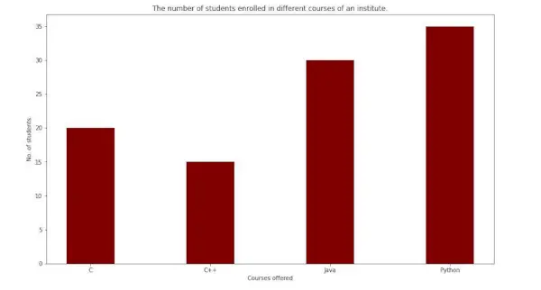
La funzione crea un grafico a barre delimitato da un rettangolo in base ai parametri specificati. Di seguito è riportato un semplice esempio di grafico a barre, che rappresenta il numero di studenti iscritti ai diversi corsi di un istituto.
Python3
import> numpy as np> import> matplotlib.pyplot as plt> > # creating the dataset> data> => {> 'C'> :> 20> ,> 'C++'> :> 15> ,> 'Java'> :> 30> ,> > 'Python'> :> 35> }> courses> => list> (data.keys())> values> => list> (data.values())> > fig> => plt.figure(figsize> => (> 10> ,> 5> ))> # creating the bar plot> plt.bar(courses, values, color> => 'maroon'> ,> > width> => 0.4> )> plt.xlabel(> 'Courses offered'> )> plt.ylabel(> 'No. of students enrolled'> )> plt.title(> 'Students enrolled in different courses'> )> plt.show()> |
Produzione-

Qui plt.bar(corsi, valori, color='maroon') viene utilizzato per specificare che il grafico a barre deve essere tracciato utilizzando la colonna corsi come asse X e i valori come asse Y. L'attributo color viene utilizzato per impostare il colore delle barre (marrone in questo caso). plt.xlabel (Corsi offerti) e plt.ylabel (studenti iscritti) vengono utilizzati per etichettare gli assi corrispondenti. plt.title() viene utilizzato per creare un titolo per graph.plt.show() viene utilizzato per mostrare il grafico come output utilizzando i comandi precedenti.
Personalizzazione del grafico a barre
Python3
import> pandas as pd> from> matplotlib> import> pyplot as plt> # Read CSV into pandas> data> => pd.read_csv(r> 'cars.csv'> )> data.head()> df> => pd.DataFrame(data)> name> => df[> 'car'> ].head(> 12> )> price> => df[> 'price'> ].head(> 12> )> # Figure Size> fig> => plt.figure(figsize> => (> 10> ,> 7> ))> # Horizontal Bar Plot> plt.bar(name[> 0> :> 10> ], price[> 0> :> 10> ])> # Show Plot> plt.show()> |
Produzione:

Si osserva nel grafico a barre sopra che i segni di spunta dell'asse X si sovrappongono l'uno all'altro, quindi non possono essere visti correttamente. Pertanto, ruotando i segni di spunta dell'asse X, può essere chiaramente visibile. Ecco perché è necessaria la personalizzazione dei grafici a barre.
Python3
import> pandas as pd> from> matplotlib> import> pyplot as plt> # Read CSV into pandas> data> => pd.read_csv(r> 'cars.csv'> )> data.head()> df> => pd.DataFrame(data)> name> => df[> 'car'> ].head(> 12> )> price> => df[> 'price'> ].head(> 12> )> # Figure Size> fig, ax> => plt.subplots(figsize> => (> 16> ,> 9> ))> # Horizontal Bar Plot> ax.barh(name, price)> # Remove axes splines> for> s> in> [> 'top'> ,> 'bottom'> ,> 'left'> ,> 'right'> ]:> > ax.spines[s].set_visible(> False> )> # Remove x, y Ticks> ax.xaxis.set_ticks_position(> 'none'> )> ax.yaxis.set_ticks_position(> 'none'> )> # Add padding between axes and labels> ax.xaxis.set_tick_params(pad> => 5> )> ax.yaxis.set_tick_params(pad> => 10> )> # Add x, y gridlines> ax.grid(b> => True> , color> => 'grey'> ,> > linestyle> => '-.'> , linewidth> => 0.5> ,> > alpha> => 0.2> )> # Show top values> ax.invert_yaxis()> # Add annotation to bars> for> i> in> ax.patches:> > plt.text(i.get_width()> +> 0.2> , i.get_y()> +> 0.5> ,> > str> (> round> ((i.get_width()),> 2> )),> > fontsize> => 10> , fontweight> => 'bold'> ,> > color> => 'grey'> )> # Add Plot Title> ax.set_title(> 'Sports car and their price in crore'> ,> > loc> => 'left'> , )> # Add Text watermark> fig.text(> 0.9> ,> 0.15> ,> 'Jeeteshgavande30'> , fontsize> => 12> ,> > color> => 'grey'> , ha> => 'right'> , va> => 'bottom'> ,> > alpha> => 0.7> )> # Show Plot> plt.show()> |
Produzione:

Sono disponibili molte altre personalizzazioni per i grafici a barre.
Grafici a barre multiple
I grafici a barre multiple vengono utilizzati quando il confronto tra i set di dati deve essere effettuato quando una variabile cambia. Possiamo facilmente convertirlo come un grafico a barre ad area in pila, in cui ciascun sottogruppo viene visualizzato uno sopra gli altri. Può essere tracciato variando lo spessore e la posizione delle barre. Il seguente grafico a barre mostra il numero di studenti promossi nel ramo di ingegneria:
Python3
import> numpy as np> import> matplotlib.pyplot as plt> # set width of bar> barWidth> => 0.25> fig> => plt.subplots(figsize> => (> 12> ,> 8> ))> # set height of bar> IT> => [> 12> ,> 30> ,> 1> ,> 8> ,> 22> ]> ECE> => [> 28> ,> 6> ,> 16> ,> 5> ,> 10> ]> CSE> => [> 29> ,> 3> ,> 24> ,> 25> ,> 17> ]> # Set position of bar on X axis> br1> => np.arange(> len> (IT))> br2> => [x> +> barWidth> for> x> in> br1]> br3> => [x> +> barWidth> for> x> in> br2]> # Make the plot> plt.bar(br1, IT, color> => 'r'> , width> => barWidth,> > edgecolor> => 'grey'> , label> => 'IT'> )> plt.bar(br2, ECE, color> => 'g'> , width> => barWidth,> > edgecolor> => 'grey'> , label> => 'ECE'> )> plt.bar(br3, CSE, color> => 'b'> , width> => barWidth,> > edgecolor> => 'grey'> , label> => 'CSE'> )> # Adding Xticks> plt.xlabel(> 'Branch'> , fontweight> => 'bold'> , fontsize> => 15> )> plt.ylabel(> 'Students passed'> , fontweight> => 'bold'> , fontsize> => 15> )> plt.xticks([r> +> barWidth> for> r> in> range> (> len> (IT))],> > [> '2015'> ,> '2016'> ,> '2017'> ,> '2018'> ,> '2019'> ])> plt.legend()> plt.show()> |
Produzione:
Grafico a barre in pila
I grafici a barre in pila rappresentano diversi gruppi uno sopra l'altro. L'altezza della barra dipende dall'altezza risultante dalla combinazione dei risultati dei gruppi. Va dal basso al valore invece di andare da zero al valore. Il seguente grafico a barre rappresenta il contributo dei ragazzi e delle ragazze nella squadra.
Python3
import> numpy as np> import> matplotlib.pyplot as plt> N> => 5> boys> => (> 20> ,> 35> ,> 30> ,> 35> ,> 27> )> girls> => (> 25> ,> 32> ,> 34> ,> 20> ,> 25> )> boyStd> => (> 2> ,> 3> ,> 4> ,> 1> ,> 2> )> girlStd> => (> 3> ,> 5> ,> 2> ,> 3> ,> 3> )> ind> => np.arange(N)> width> => 0.35> fig> => plt.subplots(figsize> => (> 10> ,> 7> ))> p1> => plt.bar(ind, boys, width, yerr> => boyStd)> p2> => plt.bar(ind, girls, width,> > bottom> => boys, yerr> => girlStd)> plt.ylabel(> 'Contribution'> )> plt.title(> 'Contribution by the teams'> )> plt.xticks(ind, (> 'T1'> ,> 'T2'> ,> 'T3'> ,> 'T4'> ,> 'T5'> ))> plt.yticks(np.arange(> 0> ,> 81> ,> 10> ))> plt.legend((p1[> 0> ], p2[> 0> ]), (> 'boys'> ,> 'girls'> ))> plt.show()> |
Produzione-